| View previous topic :: View next topic |
| Author |
Topic : "Fanart-ish - Legend of Zelda (update 12/09)" |
Nendil
junior member
Member #
Joined: 12 Sep 2003
Posts: 15
Location: California, US
|
 Posted: Tue Nov 04, 2003 1:20 am Posted: Tue Nov 04, 2003 1:20 am |
 |
 |
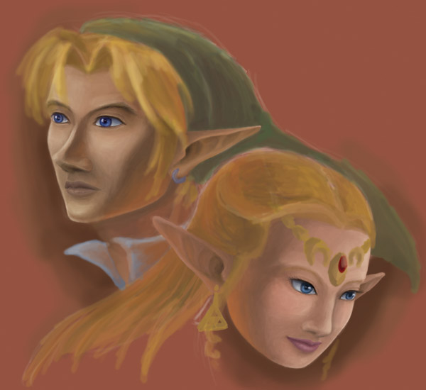
Um... this informal piece came about after I watched the Final Fantasy 7: Advent Children trailer. I was very impressed with its CG work, and I just wanted to try my hand at rendering my own favorite game characters in a realistic style. (Not in 3D, don't have that kind of skill yet  ) Nothing ambitious here, just practicing my realistic people skills... ) Nothing ambitious here, just practicing my realistic people skills...
I've been bouncing this thing off my non-artist friends for a while now, and they finally seem to be satisfied with the faces, so I was hoping to see if you guys have any criticisms or suggestions so far. I think currently my biggest weakness is working with skin colors...
_________________
Moonlit Engravings
Last edited by Nendil on Tue Dec 09, 2003 3:14 pm; edited 2 times in total |
|
| Back to top |
|
jHof
member
Member #
Joined: 23 Jun 2000
Posts: 252
Location: Chicago, IL
|
| Posted: Fri Nov 07, 2003 11:09 am |
|
|
The gradiants of the faces are pretty nice, but still seem sort of muddy. Perhapse you'd try using stronger light sources. Get some darker darks and some ligher brights. Mabe put Links right side of his face more in shadow and Zeldas more in shadow on her left side. This of course would change your background color drasticly. Which you may or may not want to consider.
It's can be hard to give a realistic feel to fiction characters we all know. You might try to referance other artist that do fantasy art with eleves. Like Borris or even the Lord of the Ring movies would be some good referances to start with.
Good lighting can do wonders for the human figure.
Keep up the good work, I'd even check out some Master works like Rembrandt and Vermeer. Both wonderful artist (Depending on your opinion I guess.) that studied from life. |
|
| Back to top |
|
Al Ian
member
Member #
Joined: 27 May 2002
Posts: 525
Location: USA
|
| Posted: Fri Nov 07, 2003 9:10 pm |
|
|
I like it!!!
The first thing I notice is the need for more contrast. As noted above, the varience in contrast just is to little. Painting it out the hard way would be my suggestion. But playing with the contrast feature in your program may give you the results you want without the hard work.
I love the eyes. I have a hard time not looking at them.
Other then that the Skin Tone is bothering me. The shading is fine when it comes to where the light is comming from. And its more then the contrast. It seems like the skin is made up of one color and then shaded in one color and highlighted in one color. If your looking for something realistic you need more colors. Take a close look at the palm of your hand, see the reds, the yellows, the blues, the pinks, even greens and purples??? That should help with realistic skin tones. Otherwise they just look flat. (just learned this one myself)
BTW I love the ears and the hair!!!
_________________

http://jmarkey77.home.bresnan.net/ |
|
| Back to top |
|
Nendil
junior member
Member #
Joined: 12 Sep 2003
Posts: 15
Location: California, US
|
| Posted: Sat Nov 08, 2003 8:38 pm |
|
|
Thanks very much for the replies. As I figured, what I need practice in is just drawing people in general. I'm not sure about upping the contrast though--I think I've already done that a lot, especially for Link. Maybe I should do something with the background color, because it itself is pretty muddy.
One thing I've found troublesome when painting on the computer is that it's relatively inconvenient to switch colors on the fly. When I'm using colored pencils, I love to just pick up a random color and put some in there. But on the computer, my immediate palette is more limited to those two "foreground" and "background" shades in the corner there. Guess I'll just have to remind myself to switch more often 
| Al Ian wrote: |
I love the eyes. I have a hard time not looking at them.
|
I'm so glad to hear that! I must've redrawn the facial features like three times before my friends would let me pass.  Here's some "before" shots so you see what I mean: Here's some "before" shots so you see what I mean:
Yuck!!
Blarg!!
(I suggest not clicking on those because they are so icky. )
Well, since the anatomy passes the test, apparently, I'll work on the colors now. Update coming sometime when I'm not so busy...
_________________
Moonlit Engravings |
|
| Back to top |
|
Nendil
junior member
Member #
Joined: 12 Sep 2003
Posts: 15
Location: California, US
|
| Posted: Sun Nov 09, 2003 11:22 am |
|
|
Ah, I see... it seems the problem was that contrast was too low--not on the faces, but on everything else! No wonder, since I hadn't done any detail work anywhere else. Check this update - I did try to put more color variance into the skin tones, but changes are much more apparent in the surrounding areas...
Also, I haven't put in any shadows casted by hair, etc. on the faces yet. That might contribute to some feeling of weirdness...
_________________
Moonlit Engravings |
|
| Back to top |
|
Al Ian
member
Member #
Joined: 27 May 2002
Posts: 525
Location: USA
|
|
| Back to top |
|
Nendil
junior member
Member #
Joined: 12 Sep 2003
Posts: 15
Location: California, US
|
| Posted: Sun Nov 09, 2003 1:32 pm |
|
|
Weird, it's showing up on my side...
Try clicking here
_________________
Moonlit Engravings |
|
| Back to top |
|
Al Ian
member
Member #
Joined: 27 May 2002
Posts: 525
Location: USA
|
|
| Back to top |
|
MaLoRuM
member
Member #
Joined: 05 Aug 2000
Posts: 208
Location: Okazaki, Japan
|
| Posted: Mon Nov 17, 2003 2:55 am |
|
|
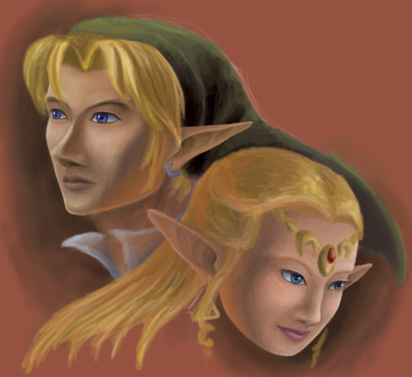
you also might want to think about Link's hair. Right now it looks a little like he has strands of Pudding on his head instead of strands of hair. Especially where his bangs drop down onto his face, there are no real thin defined lines showing that its Hair.... i mean of course its HAIR, but that section seems to look a little cartoony to me. Maybe try adding some individual strands of hair with a smaller size brush. same goes for Zelda's hair. Just a thought, looking great!
_________________
Sumimasen?!?! Nanpa anyone? |
|
| Back to top |
|
Nendil
junior member
Member #
Joined: 12 Sep 2003
Posts: 15
Location: California, US
|
| Posted: Mon Nov 17, 2003 3:00 am |
|
|
Thank you--of course I will be detailing the hair further. Right now, nothing is finished except the faces, and even those will be subject to tweaking. I'm a big perfectionist, so expect a lot more quality in the end product than this. 
I'm not sure when I'm going to get more time to work on this though...
_________________
Moonlit Engravings |
|
| Back to top |
|
Dryfire
member
Member #
Joined: 21 May 2000
Posts: 945
Location: Long Island, NY
|
| Posted: Sun Nov 30, 2003 1:07 pm |
|
|
Looks good, keep working on it, you did a great improvement on adding more contrast and shadows to the second pic, very well done. I love Zelda fanart, someday I'll make a thread and see what all the people here have to offer, I've done a few zelda sketches myself.. Ahh, such great games!
_________________
"There is no such thing as a mistake, just happy accidents" - Bob Ross |
|
| Back to top |
|
Nendil
junior member
Member #
Joined: 12 Sep 2003
Posts: 15
Location: California, US
|
| Posted: Tue Dec 09, 2003 3:17 pm |
|
|
Working on the hair. Link's is pretty much good, but I have some trouble getting the color on Zelda to look like a realistic blond.
Back to pretending to study for finals...
_________________
Moonlit Engravings |
|
| Back to top |
|
CwStone
member
Member #
Joined: 27 Jan 2003
Posts: 489
Location: New York, USA
|
| Posted: Thu Dec 11, 2003 3:15 pm |
|
|
it looks good, but theres something about each of the faces that doesnt seem to match the original character designs. like, link looks a lot older (i think his nose is alittle too big IMHO) and zelda looks more...plump...than the original. Dont get me wrong, its a great drawing, but as far as getting a really good likeness and linking these realistic pics and the anime-ish pics of the video game it falls a little short.
BTW the hair looks mad nice
_________________
-Chase |
|
| Back to top |
|
Nendil
junior member
Member #
Joined: 12 Sep 2003
Posts: 15
Location: California, US
|
| Posted: Thu Dec 11, 2003 5:57 pm |
|
|
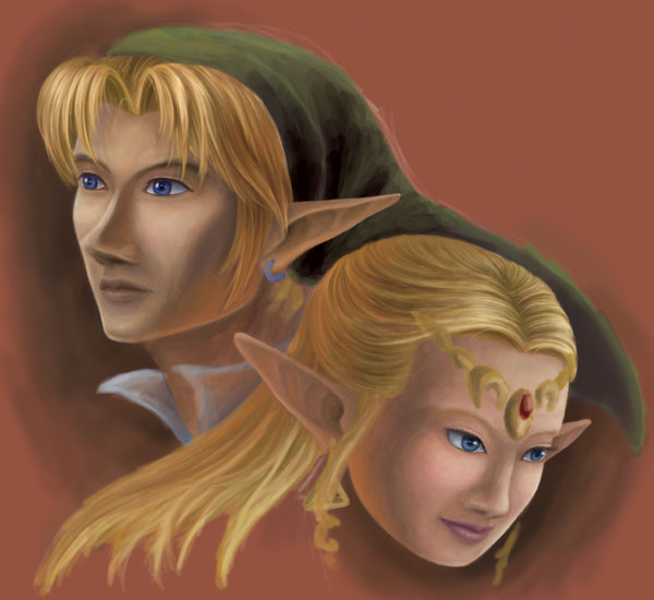
I would just like to point out that Link does have a big nose.
See lookit!
Any suggestions on how I can make him look younger though?
_________________
Moonlit Engravings |
|
| Back to top |
|
CwStone
member
Member #
Joined: 27 Jan 2003
Posts: 489
Location: New York, USA
|
| Posted: Fri Dec 12, 2003 9:40 am |
|
|
Wow...ur rit, that thing's pretty dam big  i guess i kinda forgot, it has been a while since my OoT days. Good times, good times. i guess i kinda forgot, it has been a while since my OoT days. Good times, good times.
neway, i tried for a while tryin to figure out a way to type what u could do to ur pic, but it got pretty difficult, so i did a paintover of sorts.

i barely did anything, except for croping a bit of zelda's face and doin some stuff to link's mouth. i also smoothed out some of the shadows/highlights around the nose area which each of them.
ps. dont mind the black - thats just how i croped stuff.
_________________
-Chase |
|
| Back to top |
|
Nendil
junior member
Member #
Joined: 12 Sep 2003
Posts: 15
Location: California, US
|
| Posted: Fri Dec 12, 2003 5:42 pm |
|
|
Thanks for your advice, I'll keep it in mind. I might focus on detailing the other parts first though, because I already spent soo long molding the faces that I might go a little loony. =D Nonetheless, expect improvements in the next update (hopefully!)
_________________
Moonlit Engravings |
|
| Back to top |
|
|


