| View previous topic :: View next topic |
| Author |
Topic : "Family Tree" |
The Machine God
member
Member #
Joined: 20 Aug 2002
Posts: 120
Location: Vancouver B.C. Canada
|
 Posted: Fri Sep 20, 2002 10:53 pm Posted: Fri Sep 20, 2002 10:53 pm |
 |
 |
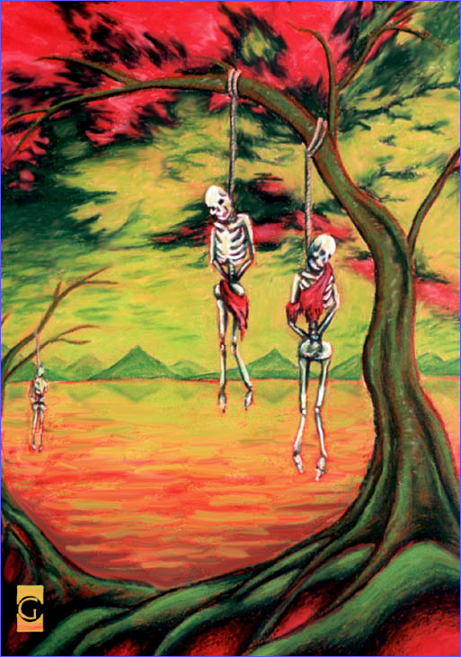
Here's a little something I did with oil pastels a few years ago. I found it today and fixed it up with Photoshop.
What do you think?
[ September 20, 2002: Message edited by: The Machine God ] |
|
| Back to top |
|
cptoonz
member
Member #
Joined: 22 Mar 2001
Posts: 243
Location: CO
|
| Posted: Sat Sep 21, 2002 6:10 am |
|
|
psychadelic and freaky...interesting style, there. I find it compelling and disturbing (in a good way). Did you use any particular method to select the colors? The color selection makes the painting, for me  |
|
| Back to top |
|
kakikukeko
junior member
Member #
Joined: 21 Sep 2002
Posts: 13
Location: France
|
| Posted: Sat Sep 21, 2002 7:20 am |
|
|
as cptoonz said, the complementary colors (red and green) work very well here, the atmosphere is very deep and oppressive..
and yes, freaky is the word
[ September 21, 2002: Message edited by: kakikukeko ] |
|
| Back to top |
|
The Machine God
member
Member #
Joined: 20 Aug 2002
Posts: 120
Location: Vancouver B.C. Canada
|
| Posted: Sat Sep 21, 2002 8:11 am |
|
|
Nope no method to my madness. It started as oil pastels so all i did was throw a wash of red acrilic down then just played with a couple red and green oil pastels. Then touched it up later in photoshop. I didn't change any of the colours in photoshop.
[ September 21, 2002: Message edited by: The Machine God ] |
|
| Back to top |
|
|


