 |
|
 |
| View previous topic :: View next topic |
| Author |
Topic : "The portfolio of my 16 (heavy)" |
Spectra
member
Member #
Joined: 11 Nov 2000
Posts: 135
Location: Montreal, Quebec, Canada
|
 Posted: Thu Oct 11, 2001 9:05 pm Posted: Thu Oct 11, 2001 9:05 pm |
 |
 |
1st time I'm posting my work on the forum.
I just had 17 while sijun's forums were down, and I draw in my free time since a year (or exactly 14 months) So here you can see a sample of the work I did in my 16.
I did not wanted to flood the forum so I had to limit the number of images and lower quality/img size (larger or higher quality img can be found at my temporary home page)http://letual.50megs.com/photo.html
There is 3 pen&ink 1 pencil and 2 digital images,.(hope the freeserver will display them, I'll move to a new host a soon as I find one.)
I like ink,and since I'm a beginner and I don't have any art formation, copying artwork is a good way to learn.
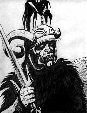
For this one I used a reference made by Roger Raupp.
Reference drawing from Terry Dkystra.
Reference drawing from David Day
And here comes the stuff 100% by me on witch I own all copyright.
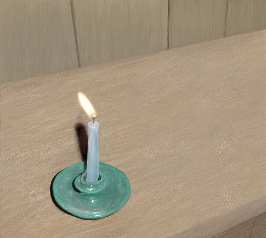
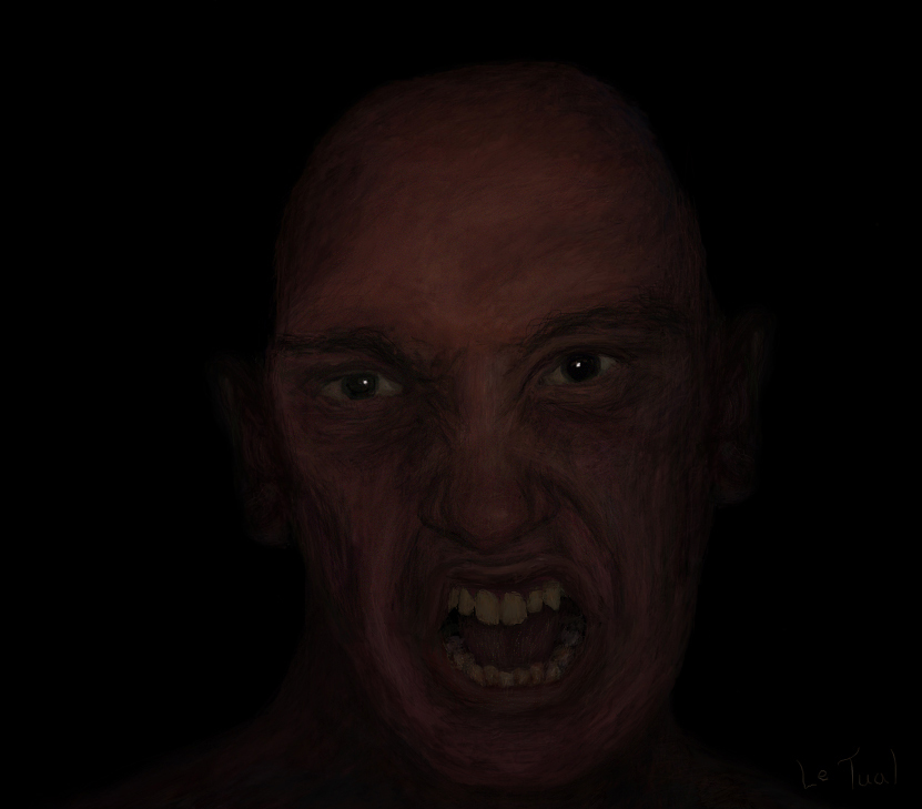
The reference was a burning candle on my desk. (done with a mouse in photoshop 5.0 on the ""super"" computer I describe below.)
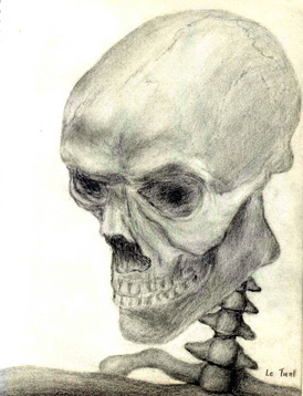
I used a little halloween plastic skull as reference witch was held by a ugly plastic stick witch I remplaced by the spine.(Done with 4B pencil)
And now the most recent and my favorite. It took about 25 hours. I'm showing it at 100% of it's size/resolution because I work on a P1 200mhz with a 15 inch screen in 800x600, so I can't do the little size down trick.
(Best viewed in a dark room, or you can toy with brightness/contrast)
(Note: 2 Mice were used to do this drawing, the 1st one got trown on the wall.(Well it was due to be changed anyway.))
All comments/crits/feedback appreciated. It would be my dream to work as an artist one day. (Give severe crits, it's the only way it can help me.)
Best wish from Quebec, hope my english is not tooo bad, and good night everyone; I'll answer to all reply tomorrow.
My temporary web page (for an unknown reason, there is 4 images that can't be seen by netscape users.) http://letual.50megs.com/photo.html
[ October 11, 2001: Message edited by: Spectra ]
[ October 11, 2001: Message edited by: Spectra ] |
|
| Back to top |
|
Ben Barker
member
Member #
Joined: 15 Sep 2000
Posts: 568
Location: Cincinnati, Ohier
|
| Posted: Fri Oct 12, 2001 3:40 pm |
|
|
Pretty good for 14 months of drawing, especially with a mouse.
If your looking for crits, here is what I think:
In general. I think you could improve in your perception of geometry. That is, your forshortening, elipses, spherical forms (like the skull), and other things are a bit off. The best way to do this is to draw a lot of cubes, spheres, and cones. Then graduate to wine bottles. Wine bottles are great practice for this sort of thing, especially if you draw all the intersecting circles. I wish my teacher made me draw wine bottles.... anyway.... Try to find those forms in what you are drawing. It's OK to make assumptions about the nature of objects to exaggerate their geometric harmony. I know that sounds gay, but that's the only way I can think to put it. Break things down into planes and spheres and elipses and things.
For the piece by piece:
Certain elements in the first one work well, and some don't work quite so well. The sword is excellent. I can tell you aren't quite comfortable drawing fingers though. A gauntlet is a fairly difficult subject to draw, so practice on hands.
The horns on the helmet are twisted in a weird way. They don't seem attached to the helmet. I have had problems with curly horns too. Just remember that the bases of the horns are circular, and they lie flat on the surface of the helmet. Worry about anchoring them down to the helmet before you worry about their twisting nature. Adding a little piece of the back horn peeking out by the cheek might help this one somewhat.
His body is a big black mass, which detracts from the entire work. It needs more information. I expect more stuff around the neck area. At least an implied elipse or two telling me which way his chest mass is defined in space. It just seems like you had problems drawing the body so you copped out and filled it in black. No shame, just don't do it next time 
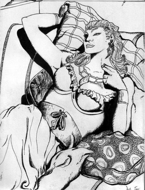
The second one is better, but is suffers from anatomy problems. It looks like you draw bodies without constructing them. That is, you draw the outlines and fill them in without construction lines. That's fine. We've all done that. But if you want to nail down that anatomy, you will have to think about the body as a series of masses in space. It takes practice and instruction.
Since you asked me to be nitpicky  , this one also lacks a good balance between black and white tones. There seems to be too much white. The woman is a light subject, so give her a dark background. Dark doesn't mean solid black, just dark. , this one also lacks a good balance between black and white tones. There seems to be too much white. The woman is a light subject, so give her a dark background. Dark doesn't mean solid black, just dark.
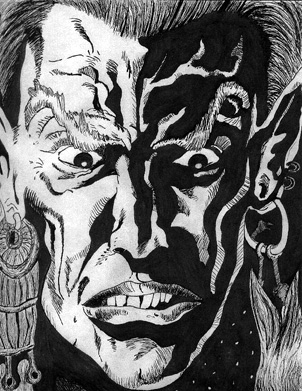
The face is the most promising one. It seems like the most planning went into it. The mouth is the only thing that turns me off. Again, remember the teeth are cylindrical, and the lips wrap around them. Nice job on the lighting. It reminds me of pulp comics. I'm not familiar with the original artist. Usually on Sijun it's good to post the reference right next to your interpretation. We can give better crits that way.
The candle one looks like it was done from a photo simply because the lightsource seems about the right intensity and in the right location for a camera flash. You can try to reduce this effect in the future by moving your light source to the side, or just let the candle be its own light source. Its also a pretty bad composition, with all that negative space on the right, and those lines that take you right off the page. Also it is generally desaturated, like photos tend to be. Nice job though, if that was your angle. This is your best piece, ignoring the composition.
On the skull the same anatomy issues apply. When I look at skulls and bones I'm reminded of structure. Skulls are the basis for the human head, and to humans they are one of the most familiar, complex, and elegant structures there are. That is the most important element of skull drawings, and that is why this drawing fails to satisfy me. It doesn't seem like it has 3 dimensions, and exists in space.
A skull's structure can be broken down into simple shapes. You are overanalyzing the skull. Don't try to define the skull with shading, try to draw all the planes of the skull. When you are drawing it, think about the back of the skull, and the parts of the skull that you can't see. Even though these things aren't visible in the drawing, they affect how it looks alot. You know what I mean?
This isn't just for skulls either. Once you know how to do this with all geometry, and if you do you are one step ahead of me, you can draw anything.
The face is also well done. My only issues are that it is a bit scribbly, and monochromatic. Be more confident with your strokes. I know that's hard with a mouse, but making big bold mistakes helps you learn better control in the long run, rather than petting all of your lines hoping you won't screw up. On the color thing, try to sneak in some complementary colors, or any colors that you think are interesting. If your values are correct, most people won't even notice that they are there. This is really quite a good job for a mouse. Sucks having a crappy computer though, I've been there
Not trying to come down on you as harsh or anything, but you asked for crits and those are mine. Just pointing out what could be improved in each one. Overall, nice work.
-[edit] oops, forgot the skull-
[ October 12, 2001: Message edited by: Ben Barker ] |
|
| Back to top |
|
Tinusch
member
Member #
Joined: 25 Dec 1999
Posts: 2757
Location: Rhode Island, USA
|
| Posted: Fri Oct 12, 2001 8:11 pm |
|
|
| I actually thought the candle one was a photo... I read the little caption that said what you used for reference, but I didn't see the picture you drew. Silly Tinusch. Haw haw haw. The face is really cool, although it looks like you used a scan of your face as reference, because of the color and lighting. |
|
| Back to top |
|
Spectra
member
Member #
Joined: 11 Nov 2000
Posts: 135
Location: Montreal, Quebec, Canada
|
| Posted: Sun Oct 14, 2001 1:42 pm |
|
|
Ben Barker : Thanx you very much, red carefully twice all what you wrote. It look like you nailed exactly what is the problem; perception of geometry. Perspective and technical drawing is my nightmare, I hate perfect shapes(elipses, spherical forms), you never see these in nature except in what mans builded.(I tried to do the sijun's lesson but and found it hard because it was too simple.) I lack the basic since i skipped it, I started to do complex drawing at the begining. But look like you can't skip it. I'll listen to you, my cool illustration will wait while im drawing cube,cone...
(For the candle, I know that it's a week composition, I did it just like that, with inspiration, it was not planned. At frist I just wanted to see if I could draw the flame, but finnaly did it all. And the goal was photorealism.)
But for the rest you pointed things I did not even tought about.
And thank you again for the time you gave me while doying your "nitpicky" crits, it's exactly what I wanted.
Tinusch: tnx for the kind words. Color's values is something very important. For the face, I used the "eyedrop" tool on the reference to build my basic color palette, everytime looking at photoshop's "color wheel" to see where the color was, what was it's value. The value for a dark image are way darker than what I tought it was. I'm in an intense learning process, won't need to do that when I'll have more practice.
Sorry for replying this late, but did not have acces to a computer in the last 30 hours.(Was gone in a forest expedition and we sleep there.) |
|
| Back to top |
|
|
|
You cannot post new topics in this forum
You cannot reply to topics in this forum
You cannot edit your posts in this forum
You cannot delete your posts in this forum
You cannot vote in polls in this forum
|
|
Powered by phpBB © 2005 phpBB Group
|


