| View previous topic :: View next topic |
| Author |
Topic : "Wedding Gift" |
cgaddict
junior member
Member #
Joined: 01 Jan 2008
Posts: 14
Location: Long Island City, NY
|
 Posted: Tue Apr 15, 2008 3:02 am Posted: Tue Apr 15, 2008 3:02 am |
 |
 |

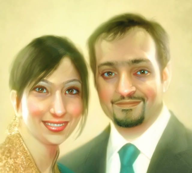
Portrait of two friends. I had a blast painting this one, and I learned a lot about skin tones as well. Feedback always encouraged 
Close up:
 |
|
| Back to top |
|
B0b
member
Member #
Joined: 14 Jul 2002
Posts: 1807
Location: Sunny Dorset, England
|
| Posted: Thu Apr 17, 2008 6:42 am |
|
|
looks great i'm sure they'll be over the moon with it!
i'd take out the highlights on the noses tho' makes them look like they have greasy skin.. |
|
| Back to top |
|
Tinusch
member
Member #
Joined: 25 Dec 1999
Posts: 2757
Location: Rhode Island, USA
|
| Posted: Thu Apr 17, 2008 1:25 pm |
|
|
| Looks good - I think both noses are far too bright, though. They're dominating both faces and don't seem to have much form. I also notice that her left eye (our right) is far more prominent than her right (our left) - I think it's the heavy shadows around her top lid and the outer edge that aren't present in the other eye. |
|
| Back to top |
|
nanshu
member
Member #
Joined: 01 Mar 2008
Posts: 71
|
| Posted: Thu Apr 17, 2008 8:53 pm |
|
|
It's a picture that is attractive for impress.  
How're you have imagined that ? which , I can not can sketch . |
|
| Back to top |
|
cgaddict
junior member
Member #
Joined: 01 Jan 2008
Posts: 14
Location: Long Island City, NY
|
| Posted: Sun Apr 20, 2008 12:25 pm |
|
|
B0b: They liked it indeed Good point about the noises, I went a bit too crazy with the highlights I admit.
Tinusch: Excellent points, especially regarding the eye - I knew something was off in that regard, couldn't put my finger on it until you pointed it out.
nanshu: Thank you. It's not so much 'imagined', as this is a portrait piece, so it was very highly referenced. |
|
| Back to top |
|
pmpn
Guest
Member #
|
| Posted: Thu Apr 24, 2008 10:54 pm |
|
|
| it looks good. detailed work in hair part i like most |
|
| Back to top |
|
|


