| View previous topic :: View next topic |
| Author |
Topic : "The Speedpainting Thread (IV)" |
The Insane Lemur
member
Member #
Joined: 19 Oct 2003
Posts: 768
|
 Posted: Tue Apr 18, 2006 12:02 am Posted: Tue Apr 18, 2006 12:02 am |
 |
 |
freebooter,falldamage, wonderful!
 |
|
| Back to top |
|
lingy-0
member
Member #
Joined: 19 Mar 2005
Posts: 173
|
| Posted: Tue Apr 18, 2006 4:33 am |
|
|
seth1,Hurri-cane,falldamage, m@, freebooter, mitsui, arttu,miles,JZA,merlyns,DARYL,wow!

_________________
http://lingy000.com/ |
|
| Back to top |
|
andreasrocha
member
Member #
Joined: 11 Jul 2003
Posts: 138
Location: Lisbon / Portugal
|
| Posted: Tue Apr 18, 2006 4:58 am |
|
|
Just a small contribuition...

 |
|
| Back to top |
|
Xavier Marquis
junior member
Member #
Joined: 01 Oct 2003
Posts: 27
Location: Paris
|
|
| Back to top |
|
Mr.Blonde
junior member
Member #
Joined: 06 Feb 2006
Posts: 36
|
| Posted: Tue Apr 18, 2006 10:15 am |
|
|
xavier, hurri, falldamage, jza, mitsui: nice work!
urbatect... I'm not quite sure but something is definently off. There is something about the way you used color that doesn't make sense to me.. I think that the saturations and color tempteratures are kinda random... the values are nice.. I recommend throwing down a light but saturated multiply layer as a glaze to tie all of your colors together. Right now they seem pretty unresolved, but if you put that glaze your value relationships will still work and the colors will be much more unified.
miles: very nice muted palette... your edges seem like too much of a focal point, mainly the corners, especially on the bottom. There is a lot of contrast on the corners and they draw my eye away from the focal point... which is indeed dead center. Try putting a "cutout" filter on your work to dumb it down and see if your composition is working. As of right now it's a pretty boring composition, if you showed more landscape to the right side of the compositon and cropped out the left third it would be more sucessful... try to think of the golden mean....if you dont know anything about golden mean it is a ratio 1:1.618... it's a compositional device, google it, they can tell you better than I can
Daryl: nice work, you are definently trying to get some color temperature variations, and that is good. However, the color still seems fairly out of balance.. I would suggest going in with some big brushes and killing some of the details and flattenign things out, then going back in and resloving some of it. I don't know for sure what the best plan of action would be. The red vertical doesn't really make sense to me compositionally perhaps you should rethink it. The enviroment is beautiful. Colors are a little bit dull, especially when you compare foreground to background. The value shifts suggest atmospheric perspective, but there isn't really any color/temperature hint. The temperature/saturation is pretty consistent throughout the painting, with the exception of the red bits... It doesn't quite feel unified to me... Perhaps try different colored glazes with light multiply layers of varying hues/saturations. You can always adjust opacity and erase out the color changes you don't like.
Flaskpost: interesting flat colors you are using. I don't think that the value/color relationships are really working, though. Perhaps try starting sketches with a very limited palette or black and white, to come up with a better composition and get your values in order.
blog: your use of the word comfort is to me ironic because your piece inspires an uneasy feeling. Was it your intention to create a comforting piece, or was it to be disturbing and nervous? Your color choice is very interesting, henri matisse used the very same color to try and achieve a comforting appealing picture in his work "the red studio" you should look into it. It is good that you are experimenting with neutral tones as well as saturated colors... You might want to try and push your use of color by doing abstraction... painting and thinking about color and form but not limiting yourself to painting something "real" I guess I am saying that because you are still so young, you should try to limit yourself to one or two goals with each piece that you do. Try working exclusively on anatomy when you want to work on anatomy, exclusively on perspective when working with perspective, and exclusively with color and mood when working with color and mood. Trying to take on too many things at one time can hurt you, and it is really difficult to pull off. If you simplify things you may learn more, faster.
good to see so many new pieces here, sorry i couldn't devote more time to more people!
enough blather, more image!
 |
|
| Back to top |
|
daryl
member
Member #
Joined: 28 Oct 2000
Posts: 441
Location: Stockholm, Sweden
|
| Posted: Tue Apr 18, 2006 11:09 am |
|
|
Mr Blonde - thanks for interesting feedback. The colors on the skullguy, I'm just exaggerating a lot, sometimes it makes sense, sometimes it comes out just like splashes of color. The reason I do this is to try making it look more interesting, not getting stuck with one kind of skin shader getting very dull and all that - but sometimes I might get out of hand with it. Can't say I know exactly what to do with the pic either, except for being more careful with the colors. About composition, I dont know much about it, what makes the red vertical not work and why?
The suburb pic - I suppose it stopped working when I removed a character walking the stairs, as I was trying to make the stairs and character sort of the foreground, and the rest as background. I agree with what you're saying, even though I feel there's a difference in hue and value in the closer houses and the ones further away, the difference might be too small.
I have a thing for not using any layered effects, but try to paint it as one or two layers at most (kinda like not being spoiled with digital stuff but to be closer to traditional painting) but I suppose it might be at my disadvantage. I should atleast use it more when trying different things.
Thanks again, I really appreciate it (and nice angle in your speedy).
And lingy-0 - awesome dude!
/D
_________________
homepage:blog |
|
| Back to top |
|
Mitsui
member
Member #
Joined: 06 Aug 2002
Posts: 642
Location: Hamburg/Germany
|
| Posted: Tue Apr 18, 2006 12:05 pm |
|
|
hurri-cane, lingy, mr. blonde thnx!
Lingy your last one kicks arse!
hurri-cane gerat creature!
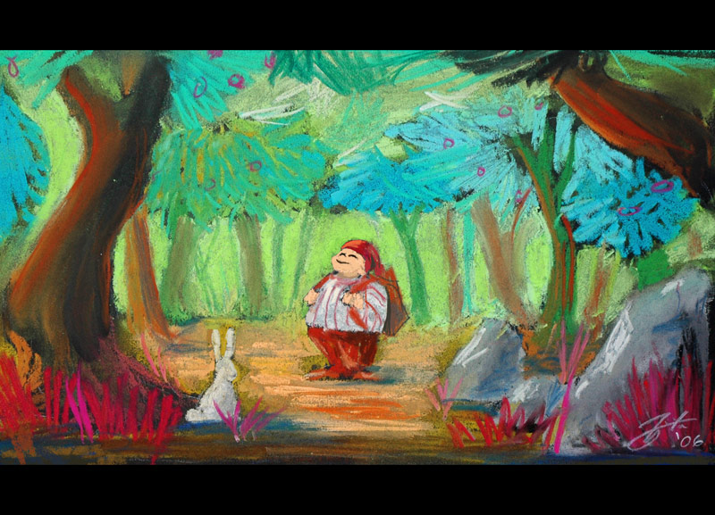
another pastel....
_________________
Goro Fujita: www.area-56.de |
|
| Back to top |
|
Mitsui
member
Member #
Joined: 06 Aug 2002
Posts: 642
Location: Hamburg/Germany
|
| Posted: Tue Apr 18, 2006 1:23 pm |
|
|
back to digital
_________________
Goro Fujita: www.area-56.de |
|
| Back to top |
|
miles
member
Member #
Joined: 17 Oct 2005
Posts: 84
Location: berlin
|
| Posted: Tue Apr 18, 2006 2:23 pm |
|
|
Hey, Mr Blonde - that is some feedback! Thanks for your time. You are probably right about the dead composition and distracting corner treatment.
I shall go into it once more just to check. As often with speedies I am too eager to post, to wait for another break to reconcider my work. But that not as an excuse. Master Spooge once said that if your image doesn't look right after 10 Minutes or anytime down the process of painting, you better start over again...
What you said about Flaskpost's may be true, but not account to the fun of messing with strange colours.
thanks lingy-0, Hurri, Falldamage - good ones there too!
stevethomas - colour picker is fine i guess, if you learn something about colour by using it. And for work the only thing that counts is a happy client.
mitsui - your pastels are so different form your digital! Did they take shorter or longer?
Capt. Fred - Spring is coming! Not to Berlin, but at least to Sijun...
I wanted a pointy nose like mitsui does, but - oh well.
 |
|
| Back to top |
|
Mr.Blonde
junior member
Member #
Joined: 06 Feb 2006
Posts: 36
|
| Posted: Tue Apr 18, 2006 3:28 pm |
|
|
After sparth... realized how much I hate this composition... actually I just hate the whole piece.

Speedy... random, yes?

miles: wow, thanks for the spooge info.. that makes a lot of sense. Thanks!
Daryl: hey man... not using any layers (multiply especially) is just limiting. multiply layers are not a digital-only form of "cheating" they mimic a glaze or wash just like in real life, just quicker, and you can erase. Honestly if you are limiting yourself like that I personally think you are missing out on half of digital painting... and that can not be a good thing. Thanks man |
|
| Back to top |
|
seth1
member
Member #
Joined: 06 Jun 2004
Posts: 534
|
| Posted: Tue Apr 18, 2006 10:24 pm |
|
|
REally kick ass work guys..
Quick 20 min doodle la befor bed
 |
|
| Back to top |
|
Gygaxis
member
Member #
Joined: 02 Apr 2002
Posts: 79
Location: Pasadena, Ca
|
| Posted: Wed Apr 19, 2006 1:36 am |
|
|
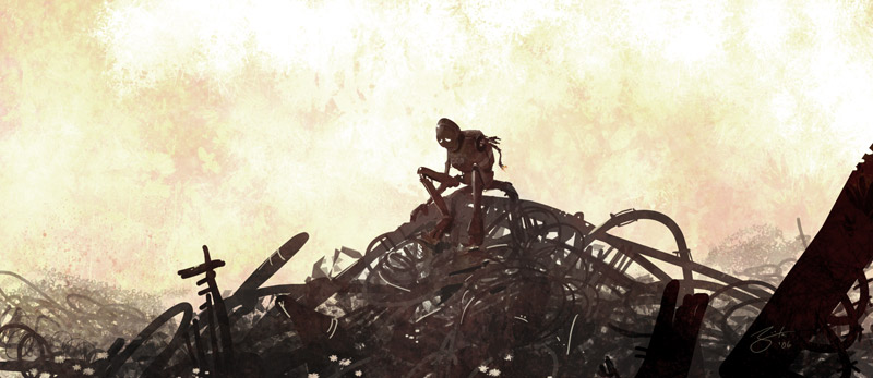
Grey scale comp for bigger painting bout an hour, no ref.

Mr Blonde: Slick environment.
Hurri-Cane: I like your Gao Gao design
Mitsui: Beautiful color schemes as always
Daryl: love the material indication
Merlyns: Those are goregeous, I can't get enough of the Sweet Marmalade banner.
_________________
�����������������������������
Deviantart
Gygart.blogspot.com |
|
| Back to top |
|
lingy-0
member
Member #
Joined: 19 Mar 2005
Posts: 173
|
| Posted: Wed Apr 19, 2006 4:09 am |
|
|
DARYL,Mitsui,miles,thanks.
Mitsui,like both of them.
Mr.Blonde,miles,cool.
fly!

_________________
http://lingy000.com/ |
|
| Back to top |
|
Capitaine Dub
member
Member #
Joined: 06 Feb 2006
Posts: 56
Location: Limoilou Beach, Quebec
|
| Posted: Wed Apr 19, 2006 6:30 am |
|
|
This page is fabulous, I'm not worthy...

_________________
Dub :: Sketchbook |
|
| Back to top |
|
Bars
junior member
Member #
Joined: 20 Jun 2004
Posts: 48
Location: Wastelands
|
| Posted: Wed Apr 19, 2006 10:59 am |
|
|
Really inspiring works everyone!
Here is mine, some fantasy stuff 

_________________
"I'm a fuel injected suicide machine. I am the rocker, I am the roller, I am the out-of-controller!" |
|
| Back to top |
|
Xavier Marquis
junior member
Member #
Joined: 01 Oct 2003
Posts: 27
Location: Paris
|
|
| Back to top |
|
miles
member
Member #
Joined: 17 Oct 2005
Posts: 84
Location: berlin
|
| Posted: Wed Apr 19, 2006 1:44 pm |
|
|
Xavier - that voodoo fury is cool!
Captaine Dub - reminds me of "Dead Man" by Jim Jarmush, nice.
Lingy-0 - yeeehaaa!!!!!!!
Mr. Blonde - Spooge said that rather about traditional media, where you block in shapes and basic colors and then step back. Because from there on you build on that. He also said pixels are cheap, and if the composition or anatomy sucks, you just paint over it. Still he posted quite a few pictures where he was unhappy with some detail, but didn't bother to fix it, because a) the whole thing wasn't worth the effort or b) seeing a problem is easy, solving it is not.
Btw: Upon browsing this thread I collected some of his essay-like posts (even though the pictures are gone on the older pages). If anyone cares, I'll think of something to make the collection readable.
 |
|
| Back to top |
|
Flaskpost
member
Member #
Joined: 14 Oct 2005
Posts: 108
Location: Sweden
|
| Posted: Wed Apr 19, 2006 2:04 pm |
|
|
Mr Blonde. Thanks for the crits man!
Miles: Awesome style you have! really stroke�y. last two from you are really cool! aand btw, I�m not that good with english, could you explain what you mean with this: "What you said about Flaskpost's may be true, but not account to the fun of messing with strange colours."? 
still trying out Painter:

_________________
www.otterclou.se |
|
| Back to top |
|
Stewart one
member
Member #
Joined: 07 Jul 2004
Posts: 156
Location: sweden
|
| Posted: Wed Apr 19, 2006 2:55 pm |
|
|
hi everyone. just finished up a latenite speedie. Turned out i ok i guess.
I was just thinking, it feels like ive been trying to master so many technical issues for a long time now and it feels like its cramping my creativity. when i paint lately im just too stuck in trying to get all the technical issues right, so that i cant think up any good ideas. Anyone ever feel the same way?
i need to sleep 
also im painting on a crappy laptop screen. so if its dark. thats why,
cool stuff going on anyway
xavier: thats intense man!

_________________
ARRR! |
|
| Back to top |
|
Mr.Blonde
junior member
Member #
Joined: 06 Feb 2006
Posts: 36
|
| Posted: Wed Apr 19, 2006 5:18 pm |
|
|
xavier: your image looks a bit oversaturated in places... I think it's a dodge tool thing. If you are going to use a dodge/burn at least do it on a BnW image so you don't kill the color... You can always add color later, it's the beauty of digital! Cool lighting anyway...
lingy-0: nice nice. kinda detached but intense, sort of a sublime feeling, congrats on the cool speedie!
gygaxis: thanks man!
miles: I would love to have that spooge file. thanks very much for info!
experimenting...
 |
|
| Back to top |
|
DangerousLlama
member
Member #
Joined: 06 Apr 2004
Posts: 264
Location: California
|
| Posted: Wed Apr 19, 2006 7:00 pm |
|
|
 |
|
| Back to top |
|
GordMacDonald
member
Member #
Joined: 25 Sep 2004
Posts: 197
Location: Canada
|
| Posted: Wed Apr 19, 2006 8:40 pm |
|
|
awesome work!
no ref

Gord
_________________
Gord MacDonald: http://www.cg2020.com |
|
| Back to top |
|
sparth
member
Member #
Joined: 14 Jun 2002
Posts: 343
Location: Seattle
|
| Posted: Wed Apr 19, 2006 10:12 pm |
|
|
awesome work peeps.
mr blonde, i love your artistic approach, it speaks to me 
haven't posted for so long. i miss doing speedies sometimes.
sparth
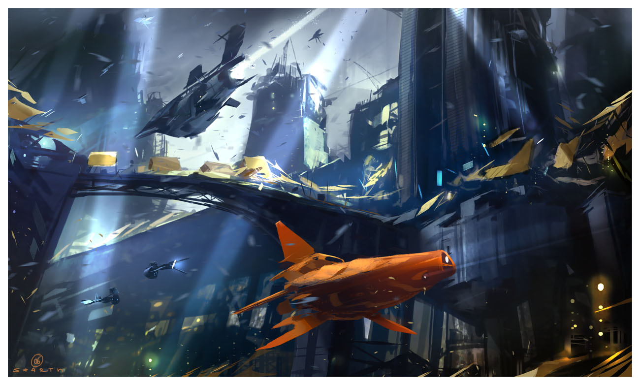 [/url] [/url]
_________________
sparth.com - art on Flickr |
|
| Back to top |
|
P-Rik
member
Member #
Joined: 14 Apr 2004
Posts: 554
Location: East of France
|
| Posted: Thu Apr 20, 2006 12:49 am |
|
|
A lil one for today ...
Sparth, you are great !
Cheers !

_________________
Pierrick l'Illustrateur des bois.
Website ! |
|
| Back to top |
|
Mikko K
member
Member #
Joined: 29 Apr 2003
Posts: 639
|
| Posted: Thu Apr 20, 2006 1:16 am |
|
|
| Sparth> A crazy one from you! I dig that you've left out a lot of the black you often use in foreground elements etc.. You've gained a lot of depth in there because of that. |
|
| Back to top |
|
chrom
junior member
Member #
Joined: 20 Apr 2006
Posts: 24
|
| Posted: Thu Apr 20, 2006 1:55 am |
|
|
Hello guys
just register to these great forums and saw this nice thread.All of u post great pieces here.
here is mine

hope u like it |
|
| Back to top |
|
3nasty
member
Member #
Joined: 05 Dec 2005
Posts: 340
Location: myspace.com/halomoto
|
| Posted: Thu Apr 20, 2006 3:20 am |
|
|
real great all..
 |
|
| Back to top |
|
retro
member
Member #
Joined: 08 Jul 2003
Posts: 146
|
| Posted: Thu Apr 20, 2006 5:11 am |
|
|

sparth: wow, very dynamic. browsed through your old stuff a couple days ago, its fascinating to see your style evolve. |
|
| Back to top |
|
chrom
junior member
Member #
Joined: 20 Apr 2006
Posts: 24
|
| Posted: Thu Apr 20, 2006 5:43 am |
|
|
here another one

retro love ur style |
|
| Back to top |
|
ManiakS
junior member
Member #
Joined: 13 Mar 2006
Posts: 10
Location: Poland
|
| Posted: Thu Apr 20, 2006 9:37 am |
|
|
this forum is great
hey pro: more advices!


 |
|
| Back to top |
|
|


