 |
|
 |
| View previous topic :: View next topic |
| Author |
Topic : "Till Death Do Us Part" |
Lunatique
member
Member #
Joined: 27 Jan 2001
Posts: 3303
Location: Lincoln, California
|
 Posted: Fri Feb 24, 2006 12:56 pm Posted: Fri Feb 24, 2006 12:56 pm |
 |
 |
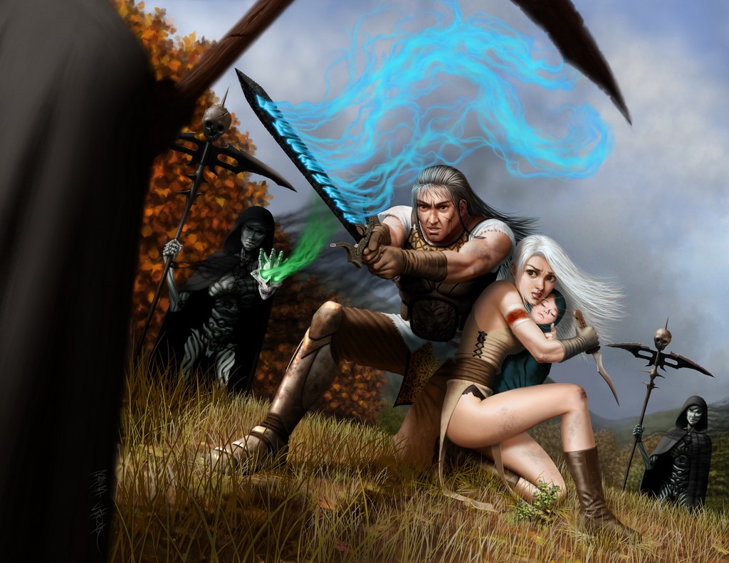
A piece commissioned by Imagine FX magazine--except that the version here has been significantly repainted and looks quite different from the published version. Some of you probably remember it as an old WIP I've had for years--well, I finally finished it.
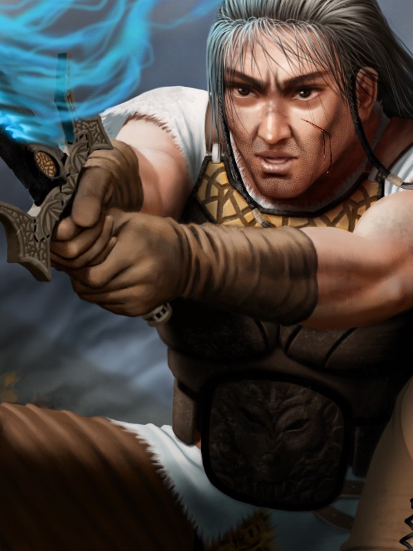
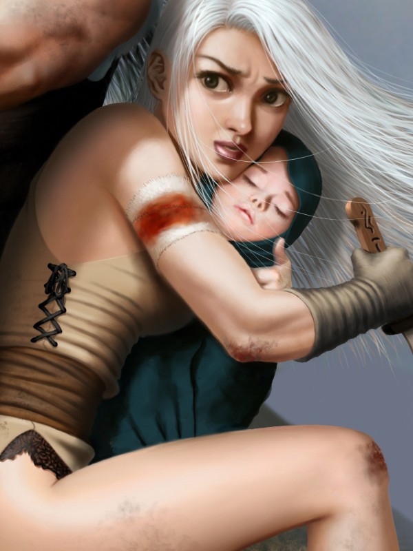
The scene depicts a father and mother trying to protect the baby from demon stalkers. The demon stalkers are like formless black smoke inside of hollow puppets made of ivory. One of them is holding a demon skull and using it to conjure dark magic. The father is conjuring magic as well with his sword.
As far as the painting goes--nothing worth writing about. It breaks no new ground and says nothing particularly special.
 |
|
| Back to top |
|
merlyns
member
Member #
Joined: 30 May 2002
Posts: 524
Location: the netherlands -_-
|
| Posted: Sat Feb 25, 2006 11:52 am |
|
|
Hey rob,
Good to see your art again, i missed it.
its a nice image, but as you said not really breaking new ground.
I really like your firm grasp on skintones, well done as always.
however im not really feeling the demons . they are just standing there, I would have loved to see more movement in them. they have lovely capes that could have been affected by the wind or movement a bit. now they are static, which imo affects most of the image. also, maybe a bit more color variation in them.
I love the detail in the mother, father and child, great work on the gloves of the father, Though I really miss texture in their clothes.
The detail is everywhere for my feeling, I would have loved to see an even more painterly background with more colours.
also the sword he's holding (which is so extremly well rendered) the blue emitted light, I think its a bit too much, but thats my own opinion about it.
I hope my reply wasnt too much, anyway good to see you post again 
_________________
 |
|
| Back to top |
|
Cicinimo
member
Member #
Joined: 03 Mar 2001
Posts: 705
Location: Seattle
|
| Posted: Mon Feb 27, 2006 6:15 am |
|
|
Hey Rob, saw it in the magazine, enjoyed the tutorial!
_________________
artpad.org |
|
| Back to top |
|
Lunatique
member
Member #
Joined: 27 Jan 2001
Posts: 3303
Location: Lincoln, California
|
| Posted: Thu Mar 09, 2006 5:56 pm |
|
|
Wow, you guys hate it that much, eh?  555 views and only two replies. I mean, at least tell me what you don't like about it.I know it's not that great, but that's why I posted it--to learn from your critiques. 555 views and only two replies. I mean, at least tell me what you don't like about it.I know it's not that great, but that's why I posted it--to learn from your critiques.
David - I wanted the demons to be kind of lifeless and odd (they're just puppet shells), but I guess it came out looking static instead.
I originally had the sword glow so faint that you could barely see it, but I think having it overpower the image now shows how desperate the father is--it's like he's giving it all he's got to protect his family. I dunno, maybe this piece just sucks. Definitely not one of my favorites--although I can't say how I would paint it different just yet. Maybe months later when I've distanced myself from it, I'll see all the stupid mistakes and bad decisions as clearly as day.
Cicinimo - hey man. I've been keeping up with your new stuff too--boy you keep improving so fast! Some really nice stuff you've done recently. BTW, you never said anything about leaving the cgtalk forum leader role, but since you haven't been there for so long, they took your name off the mod list. |
|
| Back to top |
|
gLitterbug
member
Member #
Joined: 13 Feb 2001
Posts: 1340
Location: Austria
|
| Posted: Thu Mar 09, 2006 6:16 pm |
|
|
Ok man, you asked for it. 
What I don't like about it is that it looks too clean, too smooth. I like the composition and it is very well rendered and detailed. The stiffness of the demons is ok too imo. Still there's something about it that looks odd, it makes it look a bit too artificial to me. I honestly can not tell you what could be done to it to make it more appealing (except that I don't like the eyes, but that is probably a matter of personal taste). I'm often not a fan of too smooth and clean rendered pieces in general anymore, somehow that makes them seem a bit lifeless to me. When I just look at pieces of the image, like a leg here or some clothing there it looks good, but looking at it as a whole it just doesn't come together for me.
I hope that didn't sound too harsh. Until I read your last reply I kept away from speaking my mind, simply because I hate to say bad things about an artist's painting like that. Especially when I can not even put my finger on it and come up with more contructive crits than this. Sorry. |
|
| Back to top |
|
Lunatique
member
Member #
Joined: 27 Jan 2001
Posts: 3303
Location: Lincoln, California
|
| Posted: Thu Mar 09, 2006 6:22 pm |
|
|
| You know what's funny? What you don't like about it is the same reason I don't like it myself. As everybody knows by now, I just can't seem to kick the habit of painting too clean. I've forced myself to try other ways, but it's like you just slip into a trance and your mind goes blank as the hours go by, and all the things you thought you were going to try to do differently just goes out the window. Maybe I need to have the balls to just throw away all those hours of painting and start over when that happens. |
|
| Back to top |
|
ChaosSerphM
junior member
Member #
Joined: 13 Aug 2004
Posts: 2
Location: USA, Michigan
|
| Posted: Thu Mar 09, 2006 9:12 pm |
|
|
Now I know I'm not active here, and haven't even posted anything of my own(I feel I need alot more work on my stuff to even show it on the net). I'd like to give you my feelings about this piece.
Now the piece is great, love the work. I do see things that I think would make it better. First off everyone in the picture is crisp and easy to read, I'd say add a small blur to the figures, bring them out of focus some(the one closest to the us has some on them but maybe a little more would help), may help with a little of the stiffness as well(yes I do feel they are a little to stiff). The eyes on the mother do bug me, they seem rather large for her face. You're amount and attention to detail is wonderful, but I feel the figures are to clean, sure they have a few bruses, and cuts, but if you are being hunted and chased to don't normaly have time to pause, and clean off, some dirt, mud, and grass stains in a few spots could add something. The sword is rendered wonderfully, but the blue enegry flowing from it seems a little to long, I'd see it being that long if it were swinging but if he's holding it in place, I'd see it sitting around the sword a bit more, and not reaching as much.
I feel I am being somewhat long winded. So I'll end it with that. Hope you didn't feel I was to harsh trying show where I can see a few improvments.
-CS |
|
| Back to top |
|
Max
member
Member #
Joined: 12 Aug 2002
Posts: 3210
Location: MIND
|
| Posted: Fri Mar 10, 2006 9:31 am |
|
|
I think it's a nice image overall. I have to agree with what people said though.
I won't add much talking. Instead I made this superquick Paintover.
I just played around with some layer settings and color tones.
I tried to bring more atmosphere into the pic.
Technically it's a great painting really. The detail is stunning and there's a nice story going on too. Keep it up! |
|
| Back to top |
|
Highfive
member
Member #
Joined: 08 Oct 2001
Posts: 640
Location: Brisbane, AU
|
| Posted: Thu Mar 16, 2006 7:49 am |
|
|
I'm with what everyone has written so far both in the praise and the crits. It's a fine rendering and an exciting narrative!
Luna, you mentioned that you wanted to show how desperate the father was to protect his child. I've tried a paintover here to express the anxiety more. I've covered the face of the child and put it in shadow to the parent's faces the first expressions we see, but now I don't think that works. It would work better if the child could be crying instead of sleeping, I'd say. Hope this helps!
_________________
www.high5art.com |
|
| Back to top |
|
Lunatique
member
Member #
Joined: 27 Jan 2001
Posts: 3303
Location: Lincoln, California
|
| Posted: Thu Mar 16, 2006 8:04 am |
|
|
Thanks for the C&C and the paintovers everyone!
ChaosSerphM - I agree with most of the stuff you mentioned, however the mother's eyes is a stylistic choice--my stuff has anime/mange influences. I prefer a bit of stylization over the ultra-realistic scifi/fantasy stuff we see so much of.
Max - I like what you did--it's moodier and more atmospheric. Thanks!
Highfive - I like how you put the baby's face in shadow--makes the mom's face pop out more. Thanks for taking the time! |
|
| Back to top |
|
octavian
member
Member #
Joined: 28 Feb 2004
Posts: 401
Location: Kalifornia
|
| Posted: Thu Mar 16, 2006 9:37 pm |
|
|
Hey Lunatique,
I like the imagery in this painting. I've wanted to comment before, but I couldn't think of good crits. However, I've been thinking a lot about edges because of something Cicinimo and I talked about. Soooooo, I've been looking at Sargent, Zorn, and Mullins lately. When I look at your image now, it occured to me that many of your shapes seem somewhat cutout. I think if you play up your edges so that some of the unimportant ones fall away and a few draw the viewer in via contrast, it would greatly improve this wonderful image.
Edges are drawing. Look at Rembrant's drawings, he was amazing with edges. As artists we are lucky enough to be able to exaggerate visual qualities and make our images more powerful.
Edges create rythm and harmony in a painting. By burying unimportant information, your image will read much stronger. Start looking around at those artists. I know your familiar with them, but look at them again and then come back to your painting. Maybe you'll agree with me? |
|
| Back to top |
|
Lunatique
member
Member #
Joined: 27 Jan 2001
Posts: 3303
Location: Lincoln, California
|
| Posted: Thu Mar 16, 2006 9:59 pm |
|
|
| Yep, I totally agree, and it's something I've been trying to work on, but have not been successful. Something hasn't quite clicked for me yet, as I have a lot of bad habits built up over the years that I'm trying to break. My earlier influences are all very "clean lines/rendering" guys, and I didn't start looking into the more painterly guys till I was already a working pro for many years. I wish I had been exposed to the painterly guys when I just started out--it might've changed everything for me. I'll keep working on it. |
|
| Back to top |
|
|
|
You cannot post new topics in this forum
You cannot reply to topics in this forum
You cannot edit your posts in this forum
You cannot delete your posts in this forum
You cannot vote in polls in this forum
|
|
Powered by phpBB © 2005 phpBB Group
|


