| View previous topic :: View next topic |
| Author |
Topic : "First Spell" |
Germ01
member
Member #
Joined: 06 Aug 2001
Posts: 197
Location: Montreal, Canada
|
 Posted: Sun Feb 23, 2003 7:41 pm Posted: Sun Feb 23, 2003 7:41 pm |
 |
 |
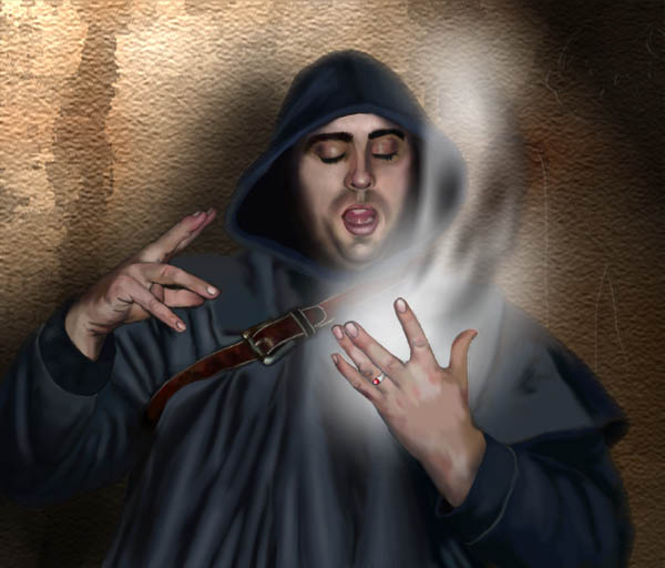
Hope you guys like it! C&C is more than welcomed! Thanks for looking!
_________________
It's better to have something and not need it, then to need it and not have it. |
|
| Back to top |
|
TimDavis
member
Member #
Joined: 11 Dec 2002
Posts: 59
Location: Georgia
|
| Posted: Sun Feb 23, 2003 8:18 pm |
|
|
I have to say, the hands are really nice! I like the cloak and the belt. Very well done there!
Two things: The background is a little too different from the foreground for my taste. If you're willing to take the time to work on it, I think a new one would add a lot. Something with a little more depth would be great!
Also the face on your character, while well rendered seems to stop a bit suddenly in the shadows. I'm not quite sure how to fix that. I would say to add a bit more shadow on his forehead, so it's not so flat. The problem with that is you seem to have used a reference with a flash. The flash is straight on the subject (obviously). You might try making the highlights on the cloak a little more pronounce around the head. Just try to match the flash on the skin.
But, I really like it! Just thought I'd share my initial thoughts.
Tim
The Art of Tim Davis |
|
| Back to top |
|
Tinusch
member
Member #
Joined: 25 Dec 1999
Posts: 2757
Location: Rhode Island, USA
|
| Posted: Sun Feb 23, 2003 8:21 pm |
|
|
| That's really cool. Love the skull. I think the background is a little intrusive, and clearly identifiable as a PS filter. I'd wipe that out and put in something a little less busy, and preferably something that fits the theme a little more. And hand-drawn. Also, it's obvious you used reference for this, as the hands look like they were lit with a flash. Nothing wrong with that, as they look very good and very realistic, but for future paintings, you might want to use references with more natural lighting. This is a very nice picture though, and again, I really like the skull. Great job. |
|
| Back to top |
|
Tinusch
member
Member #
Joined: 25 Dec 1999
Posts: 2757
Location: Rhode Island, USA
|
| Posted: Sun Feb 23, 2003 8:22 pm |
|
|
| Oops, someone beat me to it. I'll get you, TimDavis... |
|
| Back to top |
|
AndyT
member
Member #
Joined: 24 Mar 2002
Posts: 1545
Location: Germany
|
| Posted: Sun Feb 23, 2003 8:59 pm |
|
|
What still bothers me is that his left hand is lit like that. Even if it was painted more like a silhouette you could leave some of the details there.
I guess you are afraid of the step Fred Flick Stone calls "the sacrifice of the painting phase".
| Quote: |
| Go back and sacrifice those little nuances you worked so hard to achieve, but come to find they take away from the big picture, which is what we are trying to complete, and create. |
Sounds as if it has already been said ... but the part where I disagree is
| Quote: |
| the hands look like they were lit with a flash. Nothing wrong with that, as they look very good and very realistic |
That flash thingie is between the torso and the hand. So the hand shouldn't be lit like that IMO.
Btw ... was the background different in the earlier version(s)? I can't remember.
_________________
http://www.conceptworld.org |
|
| Back to top |
|
|


