| View previous topic :: View next topic |
| Author |
Topic : "baby Frankenstein!!!!!!!" |
General Confusion
member
Member #
Joined: 13 Apr 2000
Posts: 365
Location: NJ
|
 Posted: Thu Apr 18, 2002 10:57 am Posted: Thu Apr 18, 2002 10:57 am |
 |
 |
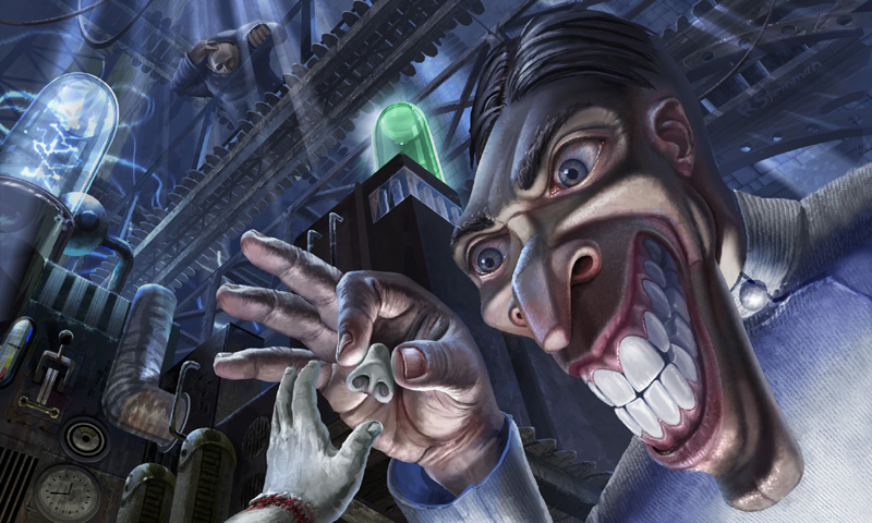
ever wonder why there wasn't "The baby of Frankenstein" movie????? 
C&C more than welcome |
|
| Back to top |
|
crabFish
junior member
Member #
Joined: 11 Apr 2002
Posts: 13
Location: Sweden
|
| Posted: Thu Apr 18, 2002 2:44 pm |
|
|
Hehe. Really nice, gave me a good laugh!
The only thing that bothers me in this picture is the level of detail in everything except the teeth of the mad scientist.
Otherwise I think it's just great! |
|
| Back to top |
|
tek9z
member
Member #
Joined: 28 Nov 2001
Posts: 269
Location: bxl
|
| Posted: Thu Apr 18, 2002 11:11 pm |
|
|
just awesome man!
excellent stuff! |
|
| Back to top |
|
arkoh
member
Member #
Joined: 10 Nov 2001
Posts: 134
Location: Copenhagen, Denmark
|
| Posted: Fri Apr 19, 2002 12:56 am |
|
|
Wooooow...
Dunno what to say... so once again... Wooooow
Well maybe I do, I mean the lighting in the hand and the rendering of this is absolutely stunning man!!! Well the whole piece is pretty stunning as well, but I'd say the hand is without a doubt ENOUGH for me!!!
Only one negative burst... Kill that computer text man!!! It does nothin but disturbe the general impression of the piece!
Two thumbs up (and thats only because I haven't got three of them!!!  ) ) |
|
| Back to top |
|
Awetopsy
member
Member #
Joined: 04 Oct 2000
Posts: 3028
Location: Kelowna
|
| Posted: Fri Apr 19, 2002 10:25 am |
|
|
Oh cool!!!!
constructive crits.... I think the colors are a bit bland (value wise).. I think it needs brighter colors especially in the skin tone.... everything else I just love.
[ April 19, 2002: Message edited by: Awetopsy ] |
|
| Back to top |
|
Novacaptain
member
Member #
Joined: 09 Jan 2001
Posts: 906
Location: Sweden
|
| Posted: Fri Apr 19, 2002 3:14 pm |
|
|
This is very disturbing indeed. i love it.
Is Dr. frank's head supposed to be that long and stretched or is that the "baby-cam" we're looking through? Either way it makes me uncomfortable...that's one scary doctor.
The hunchback assistant looks fun too.
Very awesomely done. |
|
| Back to top |
|
The Magic Pen
member
Member #
Joined: 05 Dec 2001
Posts: 321
|
| Posted: Fri Apr 19, 2002 4:43 pm |
|
|
Damn it..that freaky ..yet Ohh so good !!  |
|
| Back to top |
|
General Confusion
member
Member #
Joined: 13 Apr 2000
Posts: 365
Location: NJ
|
| Posted: Fri Apr 19, 2002 11:26 pm |
|
|
tek9z - thanks alot, I feel that way when I see your stuff as well.. now, that I lost my job, perhaps I'll have more time to tell you when you post... and hopefully I'll be able to show more of my stuff... once I'm allowed to, NDA's and all
crabFish - I f'ed up, and posted the wrong pic, I fixed the upload and here it is with the finished teeth. I'm still going to work into it a bit more, cause I'm having this one printed for promotional use, so I want it to be nice... colors have to be finessed, etc, etc..
arkoh - goodbye to the computer text. I put it there cause I was trying to think of a way to illustrate the story behind the image as well, since, I'm using it for promotional mailer, I cant decide how to add the text commentary, about the baby frankenstein bit.. any suggestions?????, and thank for the 2 thumbs....
Awetopsy - I agree the overal color needs to be dealt with I kind of do that in the end.. (don't know if thats good practice or not, but I like to get everythign in, and then finalize it) not sayign that this is WIP, I feel its finished with some fine tuning needed, but thats why I posted it here to get a general consensus.., but thanks for the comments, I apprecaite it
any more c&c are always helpful and welcomed.... see yas on the flipside..... |
|
| Back to top |
|
Tinusch
member
Member #
Joined: 25 Dec 1999
Posts: 2757
Location: Rhode Island, USA
|
| Posted: Sat Apr 20, 2002 7:53 pm |
|
|
This is incredible. I love the colors, the idea, the painterly feel, the life and movement it has overall... Awesome job. My only complaint is that some parts are slighty unpolished, such as the light scribbles below Dr.'s bottom lip (the rest of the skin is so tightly rendered, it looks out of place) and Dr's collar, which looks a little blurry and scribbly. It could use some texture, especially when placed right next to that detailed cloth. But those are just nitpicks, this is a great piece and either way it's amazing.
[edit - I've never misspelled so many words in one post]
[ April 22, 2002: Message edited by: Tinusch ] |
|
| Back to top |
|
|


